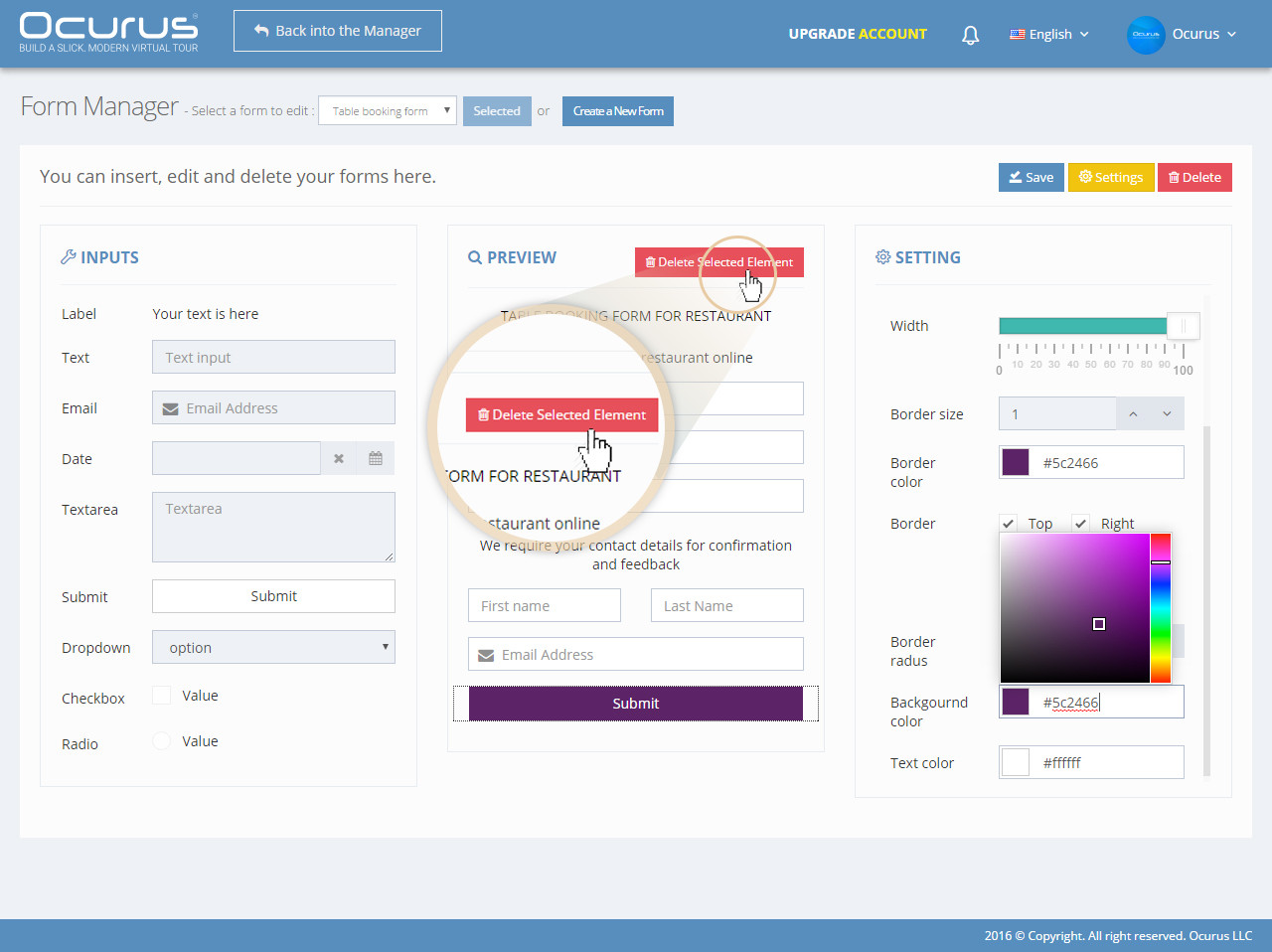
Inputs Section
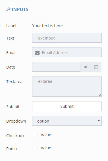
We are providing all possible form fields for our clients. You can select and use any type of field in your form.
Label - This is normal label text. You can use this as description or title of you inputs.Text Input - This is normal text input. You can use this to collect name, surname, phone number and many other purpose.Email Input - This field is designed to collect email. It have a email validation function.Date Input - Most of booking or reservation module needs this field. Because your visitors needs to fill their arrival date.Textarea - Textarea is suitable for fill much texts. Comments, feedbacks or any other big texts will be filled here.Submit button - Every types of form need at least 1 submit button to submit form datas into your email.Drop down selection - Dropdown selection field to select single option from multiple options.Checkbox - Select multiple items from multiple optionsRadio box - Choose only one option from multiple options
Preview Section
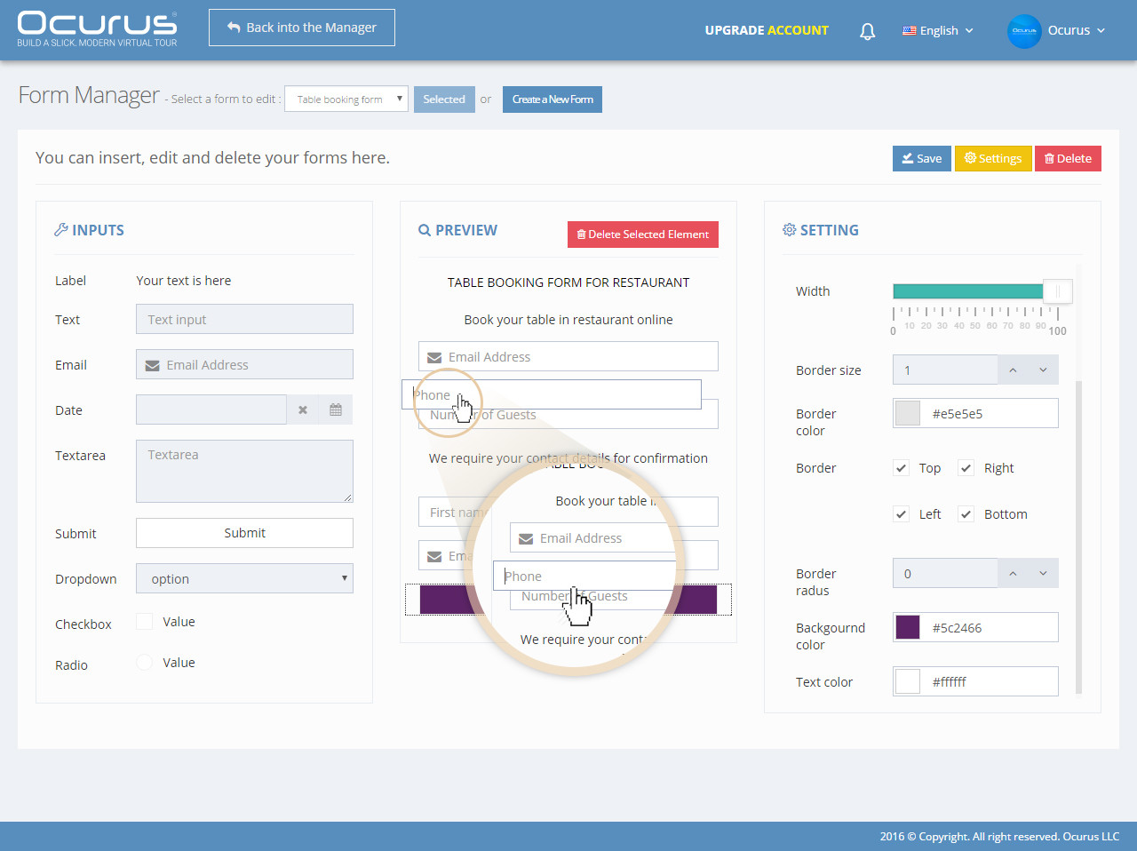
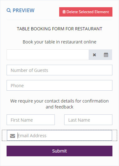
This is your preview section. Click on any fields in "Input Section" to add it into your "Preview Section".
Settings Section
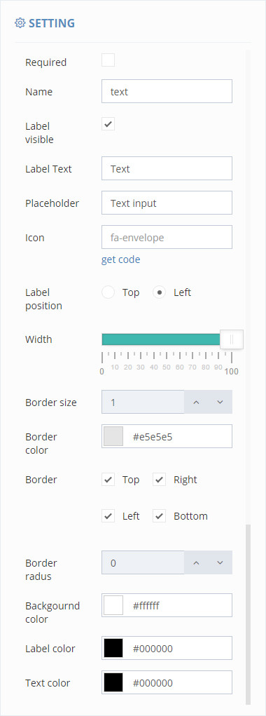
You can view this section through click in the field of "Preview section". In this section you can manage settings attributes of form field.
Required - If your field is required to fill, you should enable it.Name - Every form created in Ocurus have an email that used to send filled data. So that data must have a unique name on it.Label Visible - Label is normal texts that identify it's next form field. You can make it visible or invisible with this row.Label Text - You can write your label text here.Placeholder - Placeholder is a text indicator that is placed current form field.Icon - We are accepting font-awesome icons on form fields. So you can copy and paste your font-awesome icon code in here.Label Position - In this row, you can change your label position.Width - Sometimes, users needs to place 2 form fields in 1 row. In this case, you can change your fields width to solve it.Border Size - If you needs to thicker borders on the fields, you can change it in here.Border color - You can change your border color of your field here.Border – Those checkboxes are used to enable or disable borders of each side.Border Radius – You can set the radius in this section.Background color – In this section, you can change the background color of each field. Label color- You can change your label text color here.Text color- Every field have a placeholder text. You can change it's text color here.
You can add and re-order your form fields only with a mouse drag and drop.
Inputs delete
If you want to delete a field from your form then select a field and click "Delete Selected Element" button.
VIDEO